Engrish.com
Documenting the Engrish phenomenon from East Asia and around the world!
Documenting the Engrish phenomenon from East Asia and around the world!

Bring Love Engrish
Dang those pesky “L” words…
posted on 30 Jul 2010 in Signs
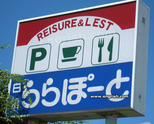
Onry the best in reraxation…
Photo courtesy of Chris Phillips.
Rest stop sign found in Niigata, Japan.

 (519 votes, average: 4.71 out of 5)
-
Newsletter - Be the Sign Up!


Home | Brog | Store | Massage Board | Advertise | Contact Us | Disclaimer
© 1999 - 2024 Engrish.com. All rights reserved.
© 1999 - 2024 Engrish.com. All rights reserved.
Come and enjoy oul new imploved flee palking Rounge and Lestaurant !
Turn light at the right.
Continental breakfast or corn poops, which for you?
Ok, Ok!!! We got it!!! It’s leisure and rest! You lacist Gleek plick!
Come tark have a nice cup of pea.
better than all the lest!!!
Don’t folget to lest at riesure & lest rest your riesure be unlestful.
Sign maker: “OK, I only need to glue these two remaining ‘R’s and one ‘L’ to my nearly finished sign. How hard can it be?”
Some say we’re the best, lest you find someone better.
I could use a rittle lest and leraxation…
Lock and Lorr!
You’rr learry rike it!
“ROR”
I suspect a photoshop job. The L is spaced farther from the E than the other letters are from each other. I think someone swapped it with the R and positioned it to match the other E’s distance from the ampersand.
Lest we folget.
Apprentice signwriter: “Boss! Whenever I put up a sign I have all these RRRs left over?
Boss: ‘Same plobrem myself.’
so is this where i take my Pee in the Cup test???
Ro and behord!
Tly oul led beans and lice.
“The lestlooms? Take a light, then a reft, then anotha light.”
@ A Non-Y Mouse: The L is off, but the R is in line with the spacing for the rest of the sign. More likely a goof on the L by the sign maker. Engrish is pretty good at making sure they’re legit.
The kana says this is at “Ra Ra Pou To”. That gets spelled in romaji as “LaLa Port”, so the Reisure & Rest fits right in. Oh, the humanity!
Open the Lala port door, HAL….
I heal this prace is wondelfur!
I’m calling shenanigans on this one. Look at the L, way too much space. The person who submitted the pic switched the letters.
We rove you engrish
:-*
Speaking from a former sign-maker’s perspective, it’s quite possible the spacing could be off between the letters on a curve like that, depending on how they put the letters on.
I can vouch for the varidity of the sign. I have sheen it while dliving on Loute 8 in Niigata Plefecture.
I don’t think the L and R were swapped. Doing so would require distorting both letters to an extent that would likely cause their edges to have slightly dissimilar characteristics than their neighbors, which does not appear to be the case here. It’s possible, but it would take a considerable amount of skill and time. If this is a fake, it would have been far easier to make up the entire sign and then replace it in the photograph (within the metal box), then add the branches and shadows. Nonetheless, it lade me maugh.
We serve all kinds of mirk shakes…..
@Synexis: It wouldn’t be so hard. Just do a perspective correction to make the sign square, swap and rotate the letters, and shift the perspective back. There are easy-to-use tools for this in GIMP and, I assume, PS. This creates a guide for doing a more direct perspective/rotation of each letter while leaving the rest of the image intact. The lighting and coloring of the sign is very consistent. Do it all at full resolution then shrink to avoid jaggies & blurs from the rotation. Voila! @Rilriia: The R only had the E to line up with and space from.… Read more »
@A Non-Y Mouse:
It IS a bit suspicious but if you zoom the picture, you’ll see that no piece of pixel is out of place, no unusual white bits…et cetela. XP
Lest & Lecreation — L&L.
@MagicalArtemis: As I said, do the manip with the full resolution version where it’s easier to clean up then shrink it so any little missed bits are averaged away.
If the modder had the raw file there wouldn’t even be any extra jpeg artifacts.
As it is, there is a somewhat suspicious blob to the right of the open space inside the L and left of the E in LEST. Could just be a jpeg artifact associated with the E, though.
Has anyone found a larger version? Tineye finds nothing.
Well… If it wasn’t faked it wont surprise me much (well, at all)
The cops laid the room when I was getting raid.
Rastro from The Jetsons goes into busiress for rimself!
Broody herr!
I’m pretty sure I saw Reisure and Lest open for somebody once…
It’s probably not a fake. “L” and “R” are perceived to have the same meaning in many asian languages. Sort of like how the difference of the “t” in “too” and in “naughty” actually sound different but are both perceived as “t” by native English speakers.
@Alinguist: I suggest that if you dictated the two words all would respond ‘too’ & ‘nauDy’ (sounds like bawdy). Not the same, or even similar: no yocks for mashup language fans here.
We play for you.